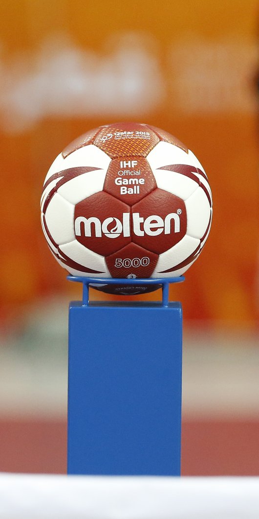
white and red handball

Sports and Design: Qatar's Transformation

A photographic essay on how the country has evolved its visual communication standards, through a sporting lens.

15 November 2022

By Anis Bengiuma, Creative Director at The Creative Union design studio, edited by Yasmine Bendjoudi, Senior Editor at The Creative Union design studio 

Share with a friend

15th Asian Games Doha 2006

Design in Qatar has always offered a very unique vantage point, a hybridity stemming dynamically from an east-meets-west perspective. Throughout my 25-year career in the creative & design industry, I have witnessed this dynamism quite literally come to life.

I arrived in Doha in October 2006 from Bahrain, and had been appointed to work as a senior designer at Fitch, just in time for the 15th Asian Games held in Doha that year. 

The beginning of my time at Fitch involved absorbing the iconic brand identity and communication strategy, which my team had devised, for what would grow to be Qatar’s event-of-the-century.

Over the next 16 years, I was to carve out a path for myself in the sector, as well as contribute to an exhilarating journey towards a social, economical and creative transformation for the nation. 

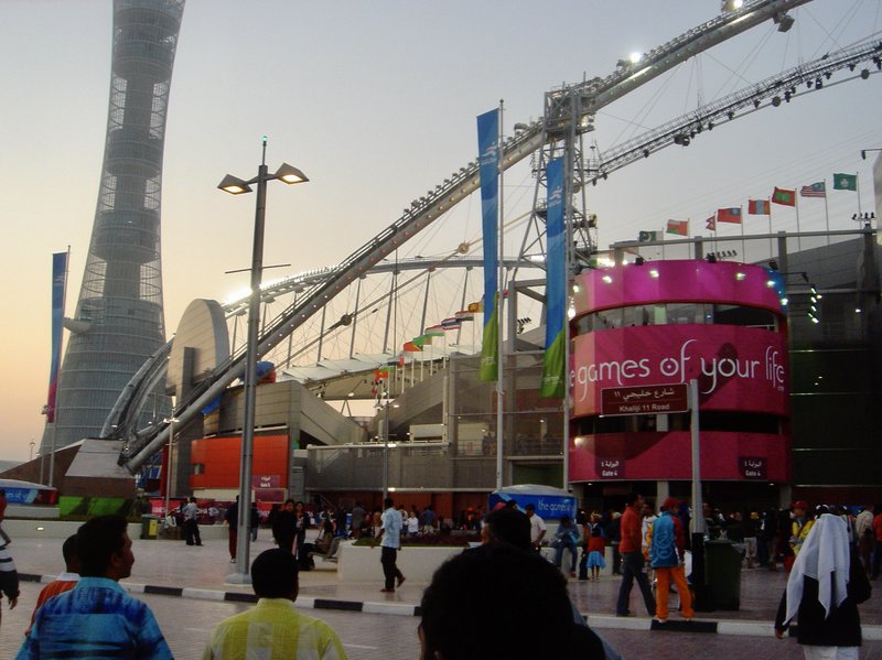
The changes happened at lightning speed, with the development of the Aspire Zone as a concrete example of Qatar’s capabilities in realizing its vision and mission of becoming an international destination for sporting excellence.

people going to asian games in aspire zone

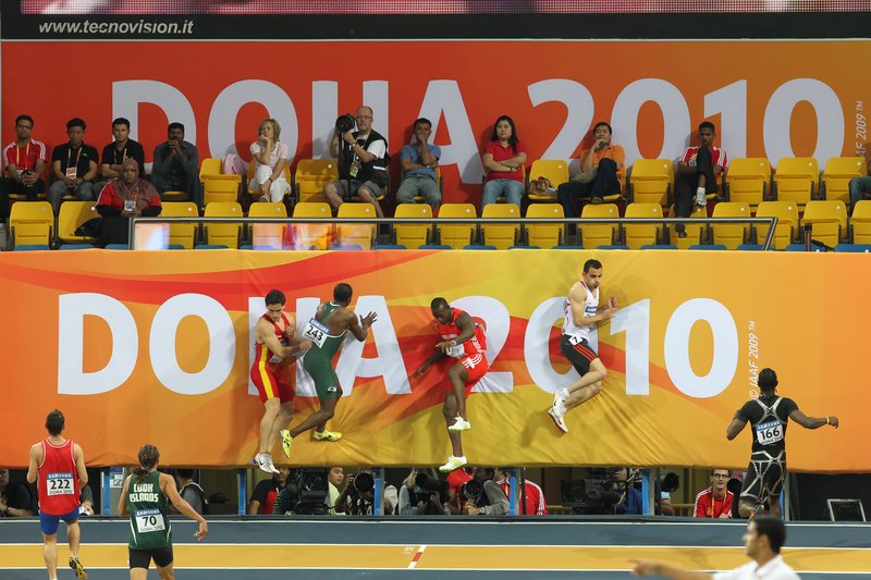
IAAF World Indoor Championship Doha 2010

My next sporting assignment came in 2010 in the form of a three-day action-packed competition in an intimate venue landscape, showcasing the best athletes in the world. It was called the IAAF World Indoor Championship.

The goal of the event’s brand development was to attract global viewership and national participation by attracting the interest of people.

A need to fuse traditional heritage with a love of athletics was key in order to build a lasting relationship and impression on the athletes and the local community.

A design solution produced in accordance with the IAAF guidelines and templates provided a brand mark for Doha, the host city.

Freedom in creativity was expressed through the distinct visual language, which carried the audience and placed them in the closest possible proximity with the athletes.

A brand language which articulated the dynamic action of the sport, while also bringing forth the country’s energy and warmth, was the result.

players in doha championship Doha 2010

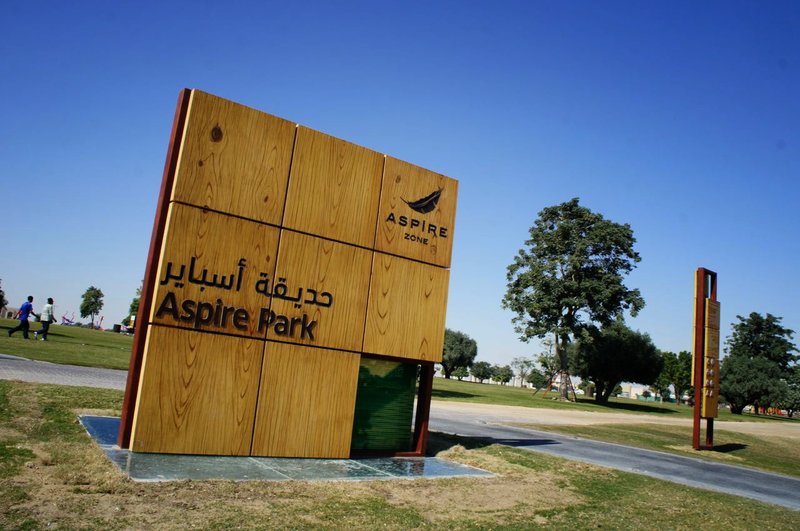
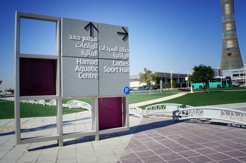
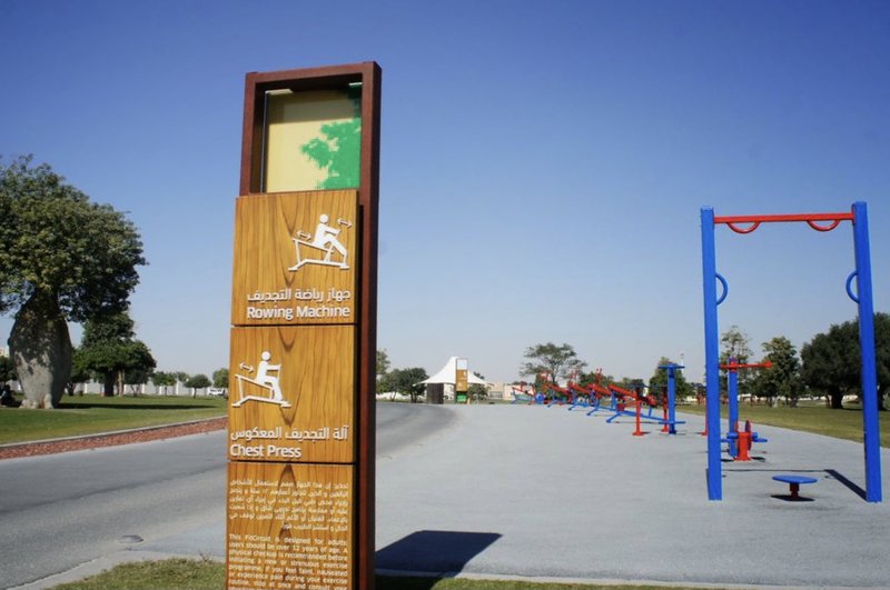
2010 Aspire Zone Signage and Way-finding

My involvement in sport-related projects didn’t stop at major sporting events. Aspire Zone signage and way-finding consolidated a way forward for the sport and design sector in the country.

Built for the 2006 Asian Games, Aspire Zone is an integral part of Doha life, offering world-class sporting, leisure and recreational facilities.These included Khalifa International Stadium, varying indoor arenas which hosted the 2010 World Indoor Athletic Championship, an Olympic-sized swimming pool, and parkland offering activities for runners, cyclists and equestrians. The core venues across an array of practices really highlighted the importance of synchronised signage.

A feasibility study, concept design development, detailing, technical resolution, layout and scheduling, around the 250-hectare sports and recreational city, presented a need to deliver a concept which responded to the individuality of the Aspire Zone facilities.

The uniqueness of the grounds had to be accentuated in the stylisation of the signage, without compromising its overall coherence and potential ease-of-use. Inventive technical detailing allowed flexibility and change, and this offered a solution which would do the world-class facilities justice for the longterm.

Aspire zone wooden signage
signage of ladies gym in aspire
Signage of rowing machine in aspire zone

15th Asian Handball Clubs’ League Championship

Doha 2012

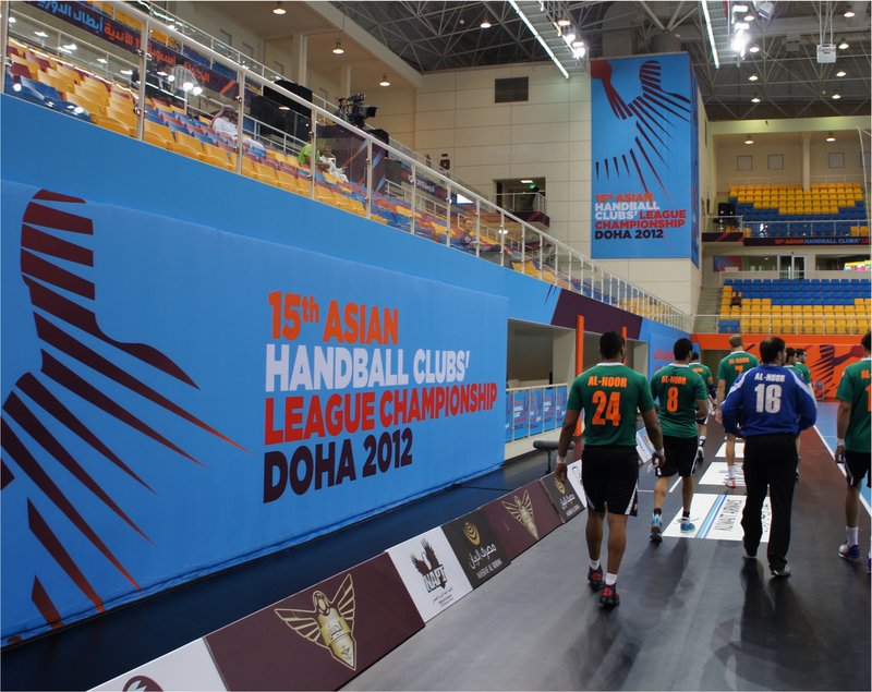
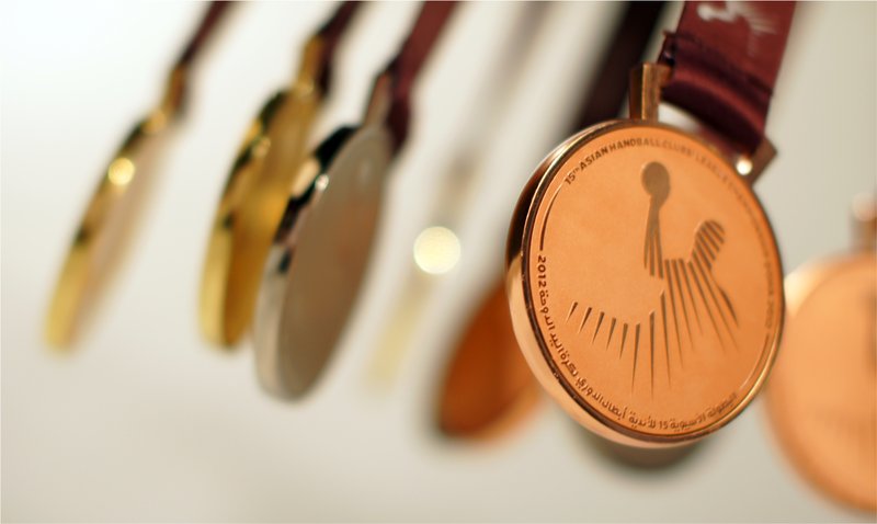
Doha hosted the 15th Asian Handball Clubs’ League Championship in 2012. The brief that arrived at my desk involved coming up with a brand identity which raised Qatar’s profile across sporting events, whilst showcasing the fast and individualistic nature of handball, from a fresh new perspective.

Before we knew it, Qatar’s consistent presence in the World Cup Championship, and its triumph at the Asian Men’s Handball Championship in previous years, would then go on to help the country win the the rights to host the World Men’s Handball Championship in 2015, for the first time.

players in handball stadium
bronze metal medal

IHF Super Globe Qatar 2014

Doha 2012

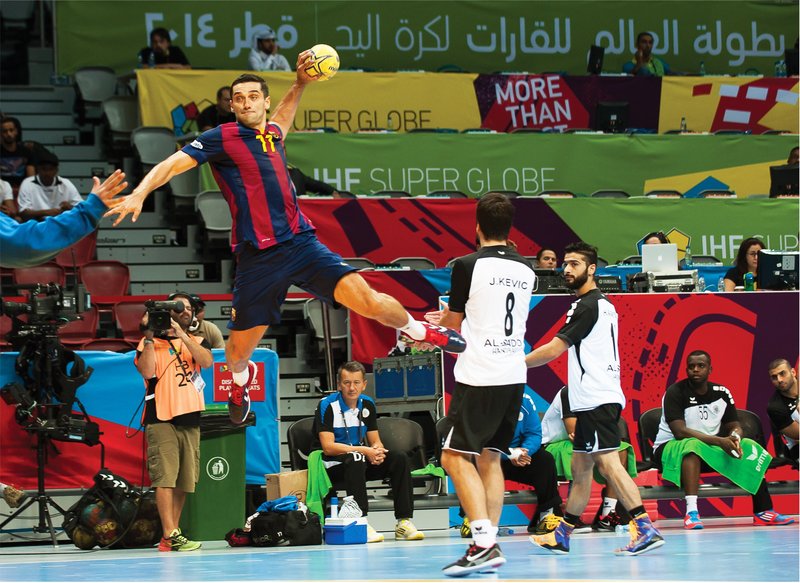
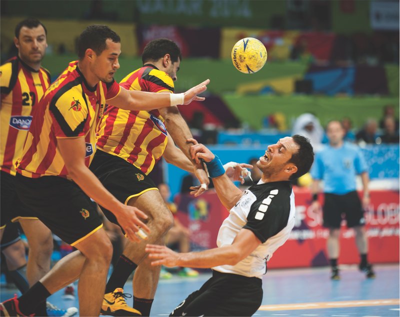
The 5th edition of the IHF Super Globe tournament, which was held from September 7 until September 12, 2014 in Doha – Qatar brought together some of the top handball players of the world.

The tournament had an existing brand-mark but lacked a consistent visual language capable of making an impact in its current tournament.

The approach was to use the audience and the player’s vantage point in the game and on the pitch. This involved considering the fast actions and pace of the game, and translating the concept into a dynamic sports graphic language that adapted easily to any application, without looking and feeling different with every use.

An advantage to this approach was that there would be plenty room for future design development.

handball player jumping
player falling while playing handball

Doha ANOC 2016

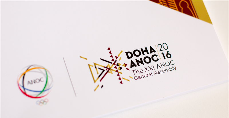
The XXI ANOC General Assembly

The Association for National Olympic Committees (ANOC) was established in June 1979 in San Juan, Puerto Rico. It is split into 5 continental associations, in which there are 206 National Olympic Committees.

The XXI ANOC General Assembly held from November 13 until November 17, 2016 was held in Doha, Qatar.

More than 1,000 representatives attended, including presidents, secretary generals of all 206 national Olympic committees, the ANOC Executive Council, representatives from international federations and future organising-committees of the Olympic Games.

The event brand-mark and visual language executed was inspired by the Qatar national flag’s 9 triangular symbols, and local Sadu and Majlis patterns which are symbols of local gatherings and authentic Qatari hospitality.

The implementation of Qatari cultural references was the start of a deeply contextual local design journey-of-exploration I was to embark on in the time that followed.

logo of anon doha

24th Men’s Handball World Championship Qatar 2015

Qatar was awarded the 24th Men’s Handball World Championship which was an important validation of Qatar’s increasing status in the sporting realm.

The event presented the country with another significant opportunity to demonstrate its ability to deliver leading international sporting events ahead of its role to host the 2022 FIFA World Cup.

The task at hand for the tournament was to develop a brand language that was flexible, adaptive and easy to implement across all championship brand touch points.

This had to be distinctive from any past and current tournament, and needed to position the championship in the league of world-class events.

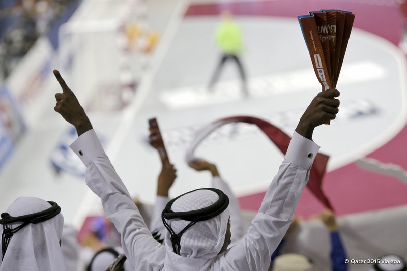
Handball is the second most watched sport in the Arab World and has a committed and passionate fan base in Northern Europe.This proved to be a definitive factor to consider in the work ahead.

Providing a platform for a colourful, engaging spectator experience; capturing the excitement, power and speed of the ‘back and forth game’; styling the current brand-mark to be flexible and applicable to all championship collateral, was key.

The approach to developing the brand language was to break down the nature of the handball game into three distinct characteristics.

The speed of the game, the fierceness of play, and the dynamism of its technique helped to create unique art patterns inspired by a deeper investigation of Sadu stitching and the Qatari flag.

These references were then adapted into a visual language supported by seven illustrated handball player poses.

The roll-out of the new brand language began in March 2014, using the core colours, orange and red, until a hundred days before the championship, which began on January 15, 2015.

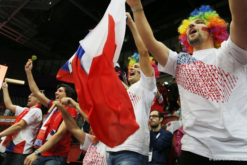
Once the tournament had kicked off, the brand language took on more of a diversely colourful aspect, and this helped create further public anticipation.

The visual language was developed to be adapted with ease, and ‘forgiven’ when not applied with accuracy, and accordance to the guidelines.

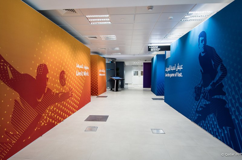
A consistency across all touch points of the championship was maintained in venues, fan zones, uniforms, corporate and communication collateral, volunteers’ look and feel, country flags, livery and merchandise.
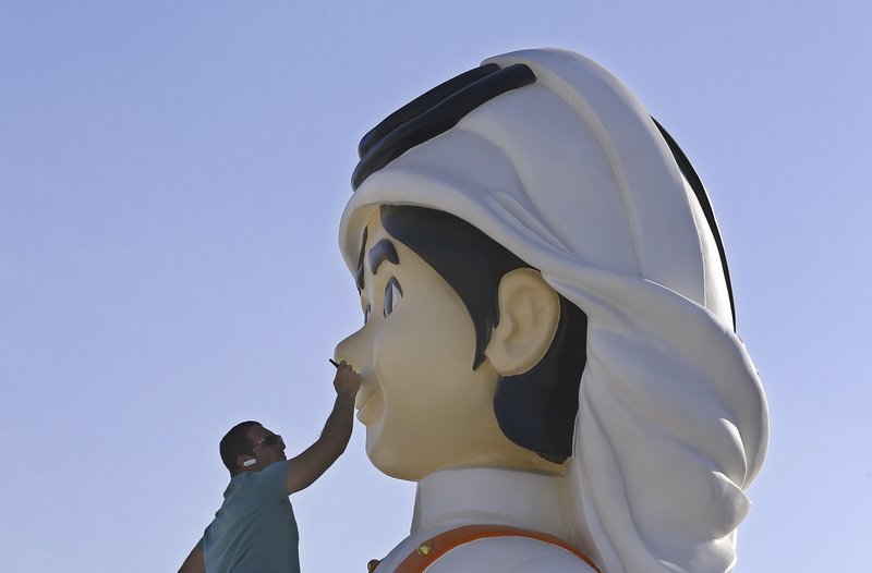
artist painting a sculpture
media room

24th Men’s Handball World

Championship Qatar 2015: The Fan In-Games Experience

audience in a handball game
Qatari kids cheering up players

24th Men’s Handball World

Championship Qatar 2015: 3-2-1 Sports and Olympic Museum, in Doha, Qatar

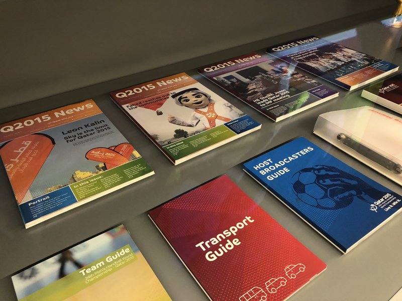
A variety of the 24th Men’s Handball World Championship Qatar 2015 guide books and mascot memorabilia are showcased at Qatar Museum’s 3-2-1 Sports and Olympic Museum, in Doha, Qatar. Fahed the mascot was developed to look like a young Qatari boy sporting the traditional local dress. It was important to emphasise his character as a young confident role model with magical powers. The design features accentuate his warm facial attributes and the way he holds himself in a positively welcoming manner.

books in sports museum

Qatar Olympic Committee and Team Qatar (Al-Ada’am)

Brand Identity

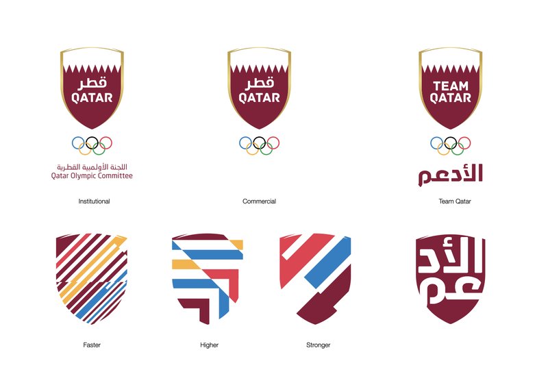
In 2016, a new assignment opened up the doors for a rebranding of the Qatar Olympic Committee (QOC) and Team Qatar. A need to refresh the elements of visual identity and find a novel way forward, both visually and philosophically, was presented. Multiple exercises were executed to refresh and reposition the entity in alignment with a 5-year national sport strategy and reform.

What transpired was a particular set of graphic elements which are a visual representation of the Olympic motto “Higher, Faster, Stronger,” using the QOC shield as a graphic container, which dynamically changes depending on context.

Using the shield meant that the lockup was; instantly recognisable, generated a strong and solid essence for the committee, and a powerful foundation to build on.

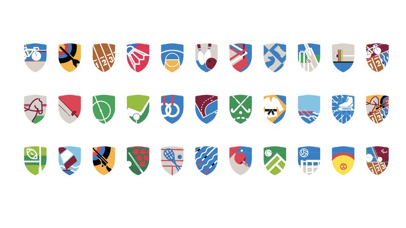
Varying shapes and colours were also used to distinguish each sporting discipline under the QOC umbrella. These gave each individual federation a proud identity to carry them through the development of their practice.

logo of rebranding Qatar team

Qatar Olympic Committee and Team Qatar (Al-Ada’am)

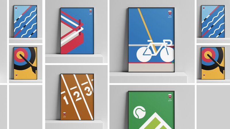
Sport Disciplines

logos for Qatar sports team
paintings for Qatar sports team

We may notice a distinctive pattern that drives sports events’ visual language and communication.

There is always a fine line between what is trending and what is considered a timeless design. As most designers would tell you, the best work is durable, resilient, contextual, and has the ability to stay relevant. The Munich 1972 Olympics and the London 2012 Olympics are prominent examples of how this has been done with efficiency and flair, and will remain to be notable benchmarks for sport branding, for some time to come.