The Olympic Games are a spectacle that is beloved by people around the world. The 1964 Tokyo Games were certainly no exception. The first games to be broadcast live (via satellite), and in colour for the first time, these Summer Olympic Games were Japan’s opportunity to reintroduce itself to the world, and particularly to the West, after the tensions of the Second World War. Post-war Japan saw a period of rapid economic, social, and technological advancements. Japan was the first Asian nation to host the Olympic Games and the country was eager to use the opportunity to showcase the “new Japan.” One of the most lasting impacts of these games was its modern and innovative design. Taking the four official posters as examples, we will look at the way that, in less than one generation, Japan reshaped its global perception from old world imperialism to a benchmark for modernity.
Tokyo 1964 Poster Photo Essay
Tokyo 1964 Poster Photo Essay by Victoria Cosgrove, Curator of the Olympic Gallery, 3-2-1- Qatar Olympic and Sports Museum, 2020-2023
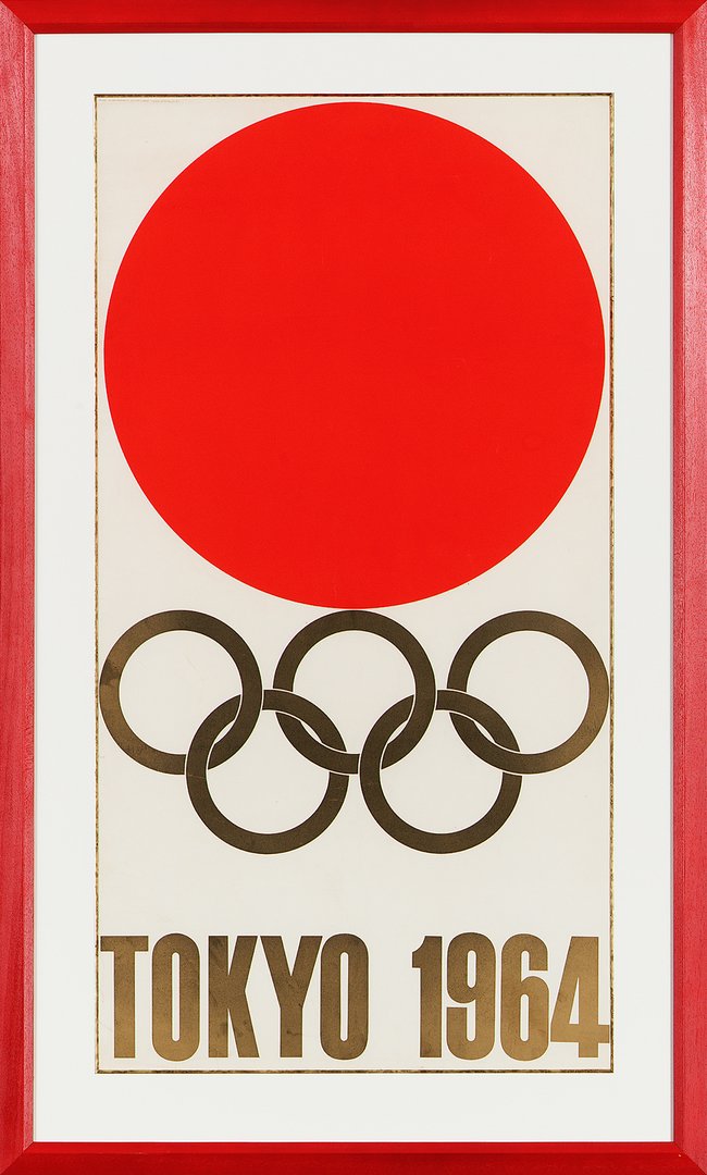
IMAGE 1 CAPTION: Tokyo 1964 official poster, designed by Kamekura Yuskau. Released in 1961. Photograph courtesy of 3-2-1 Qatar Olympic and Sports Musuem
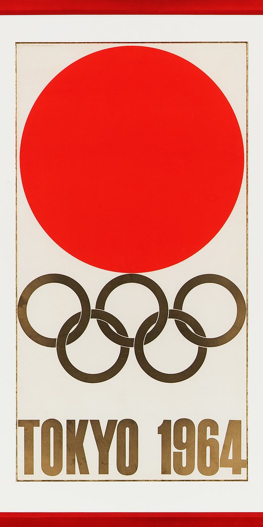
A large red circle on a white background hovers above five interlocked golden rings. A bold, clean typeface reads: “Tokyo 1964.” Kamekura Yuskau’s iconic design for the Tokyo Olympic Games was used not only for the poster, but as the emblem of the Games, and was featured on uniforms, the torch, and on the print materials published for the event. In many ways, the design could not be simpler, but its impact is undeniable. Released in 1961, the first in a series of four official posters, The Emblem is notable for the way it combined Japanese iconography with modern design aesthetics. Evoking the hinomaru, the national flag of Japan, which itself carries a complicated history, the first poster is distinctly Japanese, while carefully eschewing the iconography and symbolism that had so commonly been associated with Japanese culture in the West before the war. The use of the red circle, was itself, quite a statement, although Kamekura may not have intended it as such. To him, the intention was to express Japan’s power during its period of rapid economic growth, and to capture the dynamism of sport. However, one could argue that the dialogue between its historical and cultural meaning, derived from the conflicting aesthetic of tradition (the hinomaru) and modernism, are what make this poster exceptional.
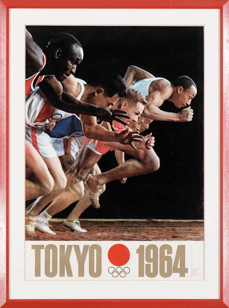
IMAGE 2 CAPTION: Starting Line, the second official poster of the 1964 Tokyo Olympic Games. Designed by Kamekura Yuskau and released in 1962. Photograph courtesy of 3-2-1 Qatar Olympic and Sports Musuem
The designs that followed continued to showcase Kamekura and his team’s innovative vision; and this marked the first time photography was used in Olympic posters. The magnificence of the photograph lies in its technical mastery. In order to create a full-bleed color image with a black background, the models and photographer had to create and recreate the shot, making adjustments until the image was perfect. To convey the look and feel of a starting line, Kamekura staged 80 false starts before his photographer captured the final image. The photograph used American servicemen who were stationed at the Tachikawa airbase, as models, as well as amateur Japanese athletes.
Although we cannot know if Kamekura had any particular message in mind when choosing his models, it is worth taking a brief moment to note the historical significance of using American military personnel as models alongside Japanese (presumably) civilians for this image. Following Japan’s surrender in World War II, the United States occupied several prefectures in the country, and imposed strict regulations around when and where the Japanese people could publicly display their national symbols. While there is no indication that the designers had any motive beyond capturing a dynamic image with the models that were available to them, it is intriguing that the post-war messaging of progress and a “new Japan”—ideas meant to obscure a colonial legacy that was no longer outwardly politically tolerated—is communicated by the visual merging of members of an occupying force (in this case the USA) with the people they are invigilating.
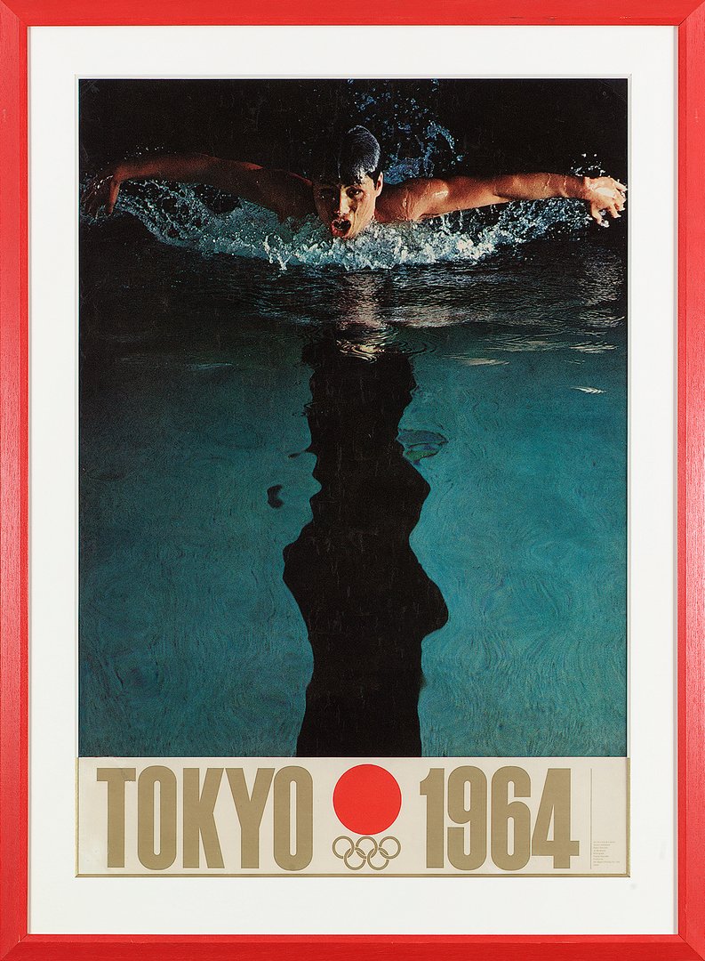
[IMAGE 3 CAPTION: Butterfly, the third official poster of the 1964 Tokyo Olympic Games. Designed by Kamekura Yuskau and released in 1963. Photograph courtesy of 3-2-1 Qatar Olympic and Sports Musuem.]
[NOTE: Option here to arrange the images as Kamekura intended, with Emblem/Hinomaru in the centre, Starting Line to the left, and Butterfly to the right. This is at the discretion of Al Journal’s art direction team.]
For the first time, an international sporting event had a unified visual language. From the typeface, to the colour scheme, each poster had a clear relationship to the others. Pulling influence from the Bauhaus, a German design school grounded in the idea of creating comprehensive artworks and merging aesthetic with everyday function, these stark images of athletes in motion succeeded in being emotive without being overly sentimental. A marked difference from the illustrations of cherry blossoms and coy women used in the posters produced for the cancelled 1940 Olympic Games.
Worth noting is that Kamekura has a clear vision of how the posters should be displayed together. After the completion of Starting Line, he began to visualise how the second poster would look in relation to his first design. By the time the third poster, Butterfly, was released in 1963, he had shared his vision that the first poster should be displayed in the centre, with the third poster displayed to the right, and the second poster displayed to the left. It was his belief that the appeal, and the amusement, of displaying the posters in this manner would highlight the elements unique to them, while still allowing the unique visual language he had created to shine. This would, to Kamekura’s mind, separate his work of graphic design from other artistic genres.
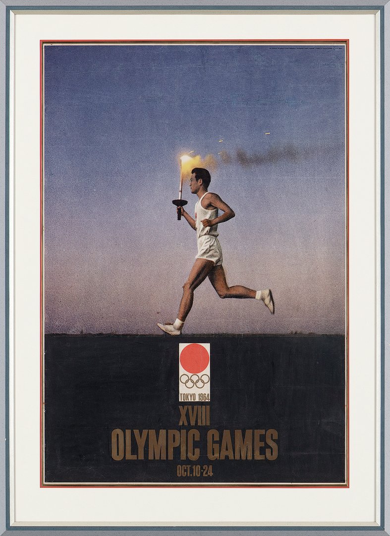
[IMAGE 4: QOSM.2013.6.126]
[IMAGE 4 CAPTION: Torch Bearer, the fourth official poster of the 1964 Tokyo Olympic Games. Designed by Kamekura Yuskau and probably released in 1963. Photograph courtesy of 3-2-1 Qatar Olympic and Sports Musuem.]
The fourth poster captures perhaps the best-known ritual of the Olympic Games: the torch relay. As with Butterfly, the design team chose to focus on a single subject, a young torchbearer. Dressed in the same white uniform that all torchbearers would wear for the eventual relay, a young man runs against an expansive horizon.
The torch relay for the 1964 Olympic Games held great significance for the Japanese organisers. In an effort to showcase the nation’s resilience, and as a nod to its future, 19-year-old Sakai Yoshinori was chosen as the final torchbearer. Yoshinori, who was known as “Atom Boy” (genbaku-ko) was born in Hiroshima on 6 August 1945; the day the United States dropped the atomic bomb. The relay, and the choice of torchbearer, were meant to demonstrate to the world the uplift and growth of the Japanese people, both economically and socially. Kamekura’s final poster image is imbued with that promise. As the flame of the torch burns strong, the torchbearer looks resolutely forward, ushering in “new Japan” for the world to see.
When considering the impact of Kamekura’s work for the 1964 Tokyo Games on graphic design in sport, but also on the field more broadly, perhaps no one says it better than the man himself:
“Tradition is one of the problems Japanese designers must work with. For designers, it is a burden that must be borne and there is no means of refusing it. It is our duty to break down our tradition into pieces and then reassemble those pieces as new tradition.”
Indeed.